



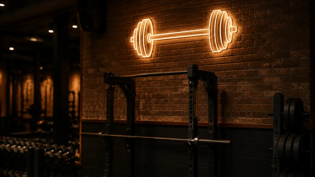
A barbell neon sign is the cheapest piece of branding a gym ever buys, and the one most likely to end up in the wrong place. It has to read from the far end of a training floor, live in a room built out of mirrors and falling iron, and still look right in the photos members post on their way out. This guide is for whoever specifies it, in a commercial gym, a boutique studio or a garage corner: where the sign goes, how big it has to be, what it should say, and how a custom order runs.
Key takeaways
Size the sign from the longest sight line on the floor, not from the wall it hangs on. Keep it above the mirror band and outside the drop zone. Then order it as a written spec, so the second one matches the first.
- About one inch of capital letter height reads at ten feet, and that is a best-case figure, so round up for a floor read at an angle (Signs.com; Pannier Graphics).
- On a lifting floor, mirrors sit 12 to 18 inches above the deck, which fixes the band a sign cannot occupy (Fab Glass and Mirror).
- A mirror doubles the sign and reverses any lettering in the reflection, so asymmetric artwork has to be approved from the room, not from the drawing.
- LED neon flex runs on a 12 V or 24 V supply at roughly 9 watts per meter, so a wall of signs costs less to run than the air handling (Sygns; Custom Neon).
- The power supply fails first, and a cheap one can cut a sign to 1 to 2 years no matter how well it was built (Kings of Neon).
01Where a barbell neon sign earns its place in a gym
Four positions cover almost every gym order, and they are not interchangeable. A sign built for a reception wall is too small behind a squat rack; a sign sized for a commercial floor is a wall of light in a garage corner. Start with a tape measure and one question: what is the longest distance from which somebody should be able to read this?
The sign trade answers the rest. Roughly one inch of capital letter height reads at ten feet, a trade rule of thumb the sign industry publishes in the same form (Signs.com; Pannier Graphics, retrieved 2026-08-28). Divide your distance by ten for your letter height in inches. Then round up: the rule assumes a clean straight-on view in decent light, and a training floor gives you neither. The sign gets read at an angle, past a rig, over people, with mirrors throwing light back at it.
Source: Signs.com, Signage 101: Letter Height Visibility; Pannier Graphics, Letter Height Visibility Chart (retrieved 2026-08-28)
Those four positions want four genuinely different signs, and the failure mode is different in each one.
| Position | Who reads it, and from where | What that means for the sign | What usually goes wrong |
|---|---|---|---|
| Rack, rig or equipment wall | Lifters and anyone crossing the floor, ten to twenty-five feet | Mid-size letters, one color, a silhouette simple enough to survive a busy rig behind it | Hung inside the drop zone, where a bar off a rack can reach it |
| Mirror wall | Everyone, constantly, plus every phone camera in the room | Mounted clear of the mirror band, artwork checked in reflection first | Lettering that reads backwards in the glass, or glare into the camera |
| Reception, brand or logo wall | Members arriving and leaving, three to fifteen feet | The studio wordmark at its cleanest; finer detail is fine at this range | Hung too high for a standing photo, so it crops out of every shot |
| Entry or street-facing window | People walking or driving past, twenty feet to over a hundred | The largest letters, one color, no fine detail; check it through window film | Local rules on illuminated street-facing signage were never checked |
Two checks before anyone approves a size. Tape the outline up at full scale and look from the farthest point in the room, with the lights set as they run during a class. And settle where the power comes from before the artwork is final, or a cable will drop through the middle of the sign for a decade. The shapes and backing styles these positions land on are visible across the custom neon signs range.
02Why the mirror wall changes the whole plan
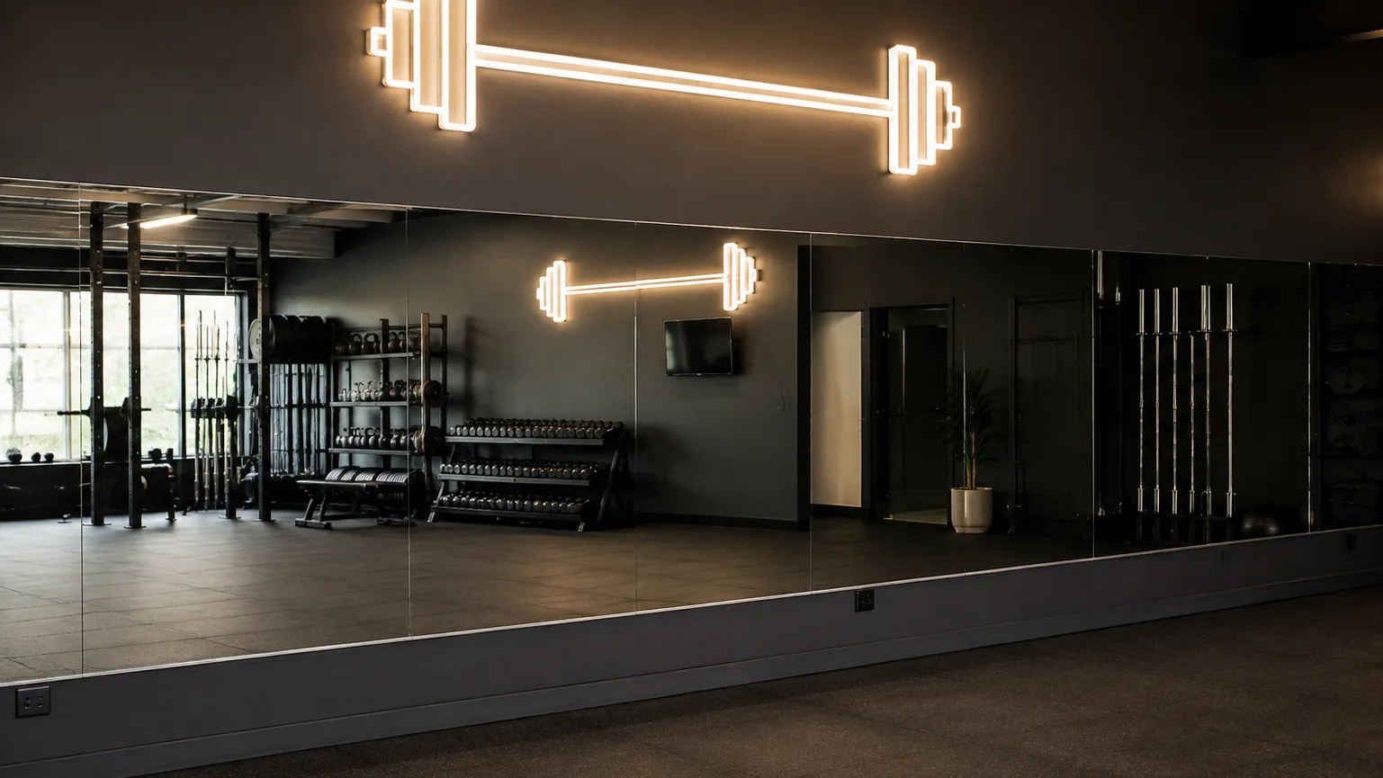
A gym is the only interior that is mostly mirror by surface area, and that single fact rewrites the signage brief. A mirror does three things to a sign hung near it, and only one of them is automatically good.
It doubles it. The reflection is a second sign at the same size and brightness, which is why a piece that looked modest on the drawing takes over the room once it is lit. Designers use that deliberately, hanging a small sign opposite a mirror run so it reads twice — fine as a decision, expensive as a discovery on install day.
It reverses it. Anything visible in the reflection reads backwards, and on a lifting floor the reflection is the primary view because everyone is facing the glass. A barbell or dumbbell silhouette survives this without complaint, since it is symmetrical. A script wordmark does not. If members mostly see the sign in the mirror, the reflected version is the real product, and the one that has to be approved.
And it fixes the vertical envelope. On weightlifting, functional fitness and garage floors, mirrors get mounted 12 to 18 inches above the deck so the bottom edge sits out of reach of stray plates (Fab Glass and Mirror, Gym Mirror Placement Guide, retrieved 2026-08-28). Yoga, Pilates and floor rehab rooms go the other way, with the glass flush at 0 inches so horizontal alignment stays visible. Either way the mirror owns the eye-level band, so the sign lives above it, which pushes the read distance up and, by the letter-height rule, the letter height with it.
One habit is worth building in: hold a phone camera where members actually stand and check the sign in reflection before signing off artwork — a screen preview never shows the reversal.
03Barbell, dumbbell or wordmark: what the sign should actually say
A gym sign works best carrying one idea, and the orders come down to three: an equipment silhouette, a short phrase, or the studio wordmark. Stacking all three makes a sign read as a novelty item bolted onto a fit-out rather than part of it.
The silhouette route is the most forgiving. A barbell reads instantly at any size, has no orientation problem in a mirror, and does not date the way a slogan does. It also survives being the only sign in the room, where one motivational line shouted at an empty six-a.m. floor ages fast.
A handful of constraints are specific to the medium, and knowing them before artwork goes out usually saves a whole proof round.
- Stroke width wants to be even. Neon is a continuous run of light, so a typeface built on thick-to-thin contrast loses the thing that made it distinctive once it becomes tube.
- Tight kerning fills in. Letters that nearly touch on a printed membership card glow into each other on a wall, and gym wordmarks are very often set tight on purpose.
- Every color is its own section, meaning another run and another set of joins. A two-color logo is not double the price of a one-color one, but it is never the same price.
- The backing decides whether it floats. Cut-to-shape disappears against a dark wall and the barbell appears to hang in the air; a rectangular panel reads as a framed sign and is easier to hang level on a rig-mounted batten.
- Send vector artwork. A logo pulled off a website gets redrawn either way, and an unsupervised redraw is the most common single reason a first proof comes back wrong.
Color does more work than buyers expect. Warm white and amber read as a strength gym and photograph close to how the room actually looks. Saturated pink, teal and violet read as a boutique studio and take over the picture — either the point or the problem, depending on what that wall is for. If the sign is mainly lettering rather than a shape, the guide to custom neon name signs goes further on making a name legible in tube form; if the site also runs a juice counter or a bar, the personalized neon bar signs guide covers that fit-out.
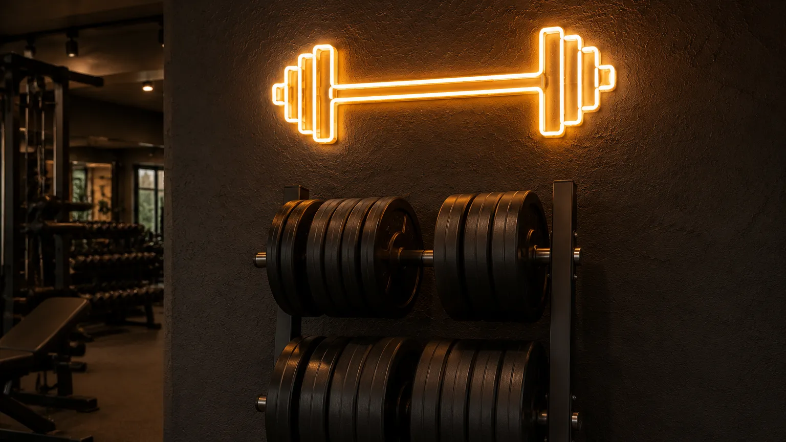
04Custom neon gym signs: turning a studio logo into tube
Custom neon gym signs are almost always a logo problem before they are a manufacturing problem. A gym brand that works on a T-shirt, an app icon and a window vinyl has three slightly different versions of itself by year two, and the one emailed to a sign maker is whichever was on somebody’s desktop.
What a fabricator needs is not the prettiest file but the simplest: outlined vector paths, one flat color per section, no drop shadows, no gradients. A gradient has to be interpreted, and interpretation is where proofs go wrong. Two Berlin operators show how far one identity stretches: one ran a large indoor LED neon logo on the studio’s back wall plus a second sign above the entrance; another put its logo behind reception (Sygns, Gym Neon Signs for Fitness Studios and Interiors, retrieved 2026-08-28). Two signs off one identity in the first case, not one file used twice.
Signage also gets difficult at the second location rather than the first. Order studio by studio, from whoever is cheapest that quarter, and within a year the magenta is off in one room and the strokes are fatter in another. None of that shows in isolation; all of it shows side by side on the brand’s own social feed.
The fix is to treat the sign as a spec rather than a purchase.
- One master file. Vector, with the location name on its own layer so it swaps without redrawing the layout.
- A written spec sheet: overall dimensions, capital letter height, colors, backing shape, mounting method, and which side the power exits. That sheet, not the logo file, is what a supplier quotes against.
- One approved physical reference. Screens disagree about neon colors more than about almost anything else, so approve a real sign, keep it, and match every later batch to it.
- The same source for reorders. Color and stroke drift most when a repeat order moves to a different maker for a small saving.
- A spare on the shelf. One dark sign in a room full of matching ones looks worse than no signs at all, and a spare turns that into a five-minute swap.
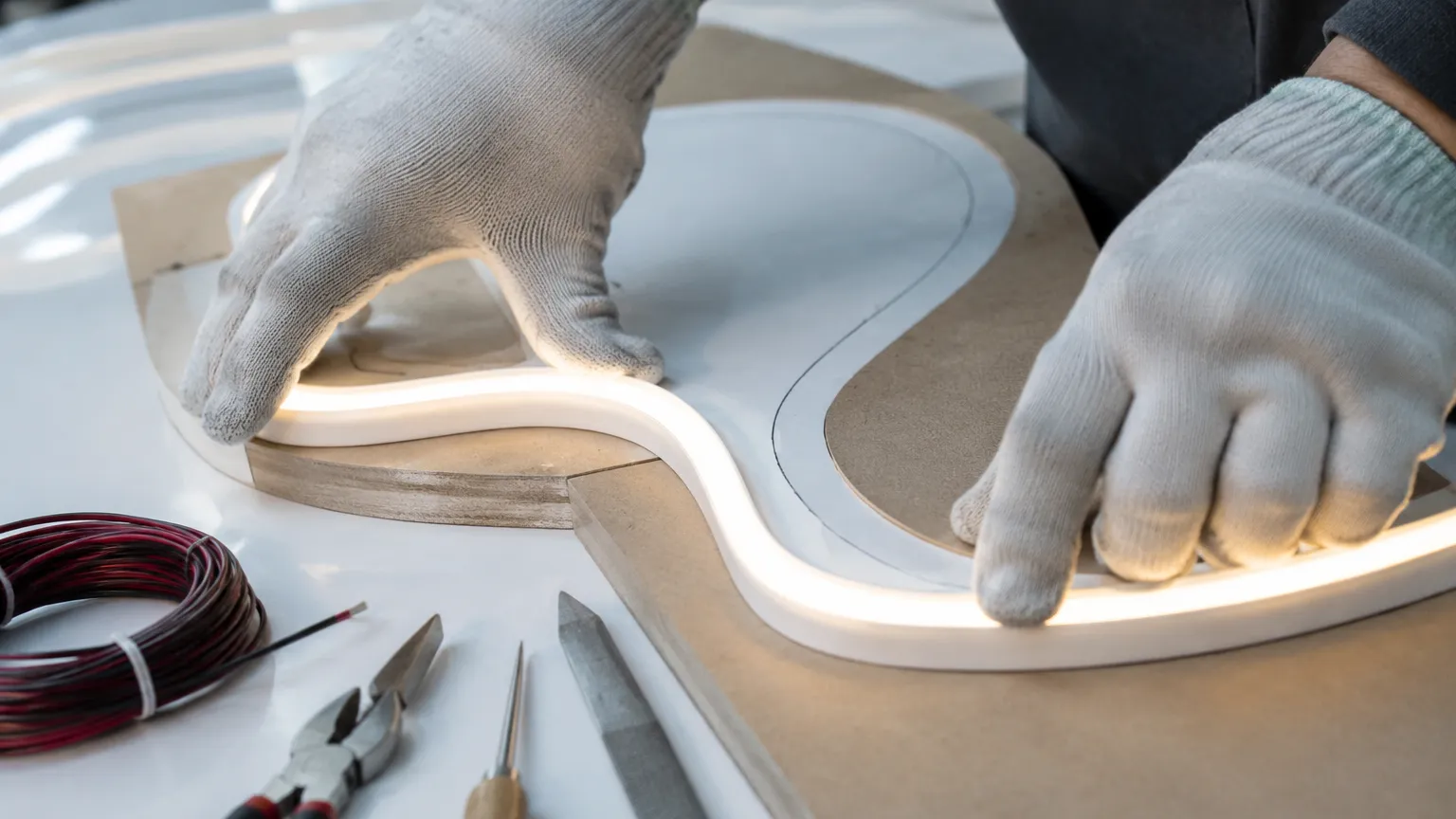
05Sweat, chalk and specifying for a real training floor
A gym is a harder environment for a light fitting than a bar or a shop floor, and the reasons are unglamorous: chalk dust, aerosolized sweat, wipe-down chemicals, and humidity that spikes through a class and then falls away again.
The target conditions are at least published. The International Fitness Association’s range for weight training, cardio and Pilates floors is 65 to 68 degrees Fahrenheit, or 18 to 20 degrees Celsius, with relative humidity held between 40 and 60 percent (Gym Insight, citing IFA, retrieved 2026-08-28). That is a design condition, not a description of reality: a full class in a small studio pushes the top of the humidity band and holds it there. The sign has to be comfortable in a warm, damp, dusty room, not an office.
Three consequences follow. The first is that the power supply needs air. It fails first in an LED neon sign, and a cheap or mismatched one can cut the sign to 1 to 2 years regardless of how well the sign was built (Kings of Neon, How Long Do Neon Signs Last, retrieved 2026-08-28). Sealing the driver into a closed cavity behind an acrylic backing, or tucking it behind matting where chalk settles, is the surest way to make a good sign fail early. Give it a ventilated position with access: it is the one part anyone will need to replace.
The second is that wet zones want a rating rather than a promise. A sign in a dry weights room is an ordinary indoor fitting. A sign near a pool deck, a sauna corridor, a hot yoga studio or an outdoor rig is a different specification, bought against an ingress protection number rather than the word waterproof — the same discipline laid out in the guide to waterproof LED strip lights and IP ratings.
The third is to mount for cleaning. A sign at head height on a rack wall will be knocked, sprayed with wipe-down solution, and eventually wiped by somebody in a hurry. Standoff mounting with a small air gap, rather than a flush adhesive fixing, lets the wall be cleaned around the sign and the sign come down without taking paint.
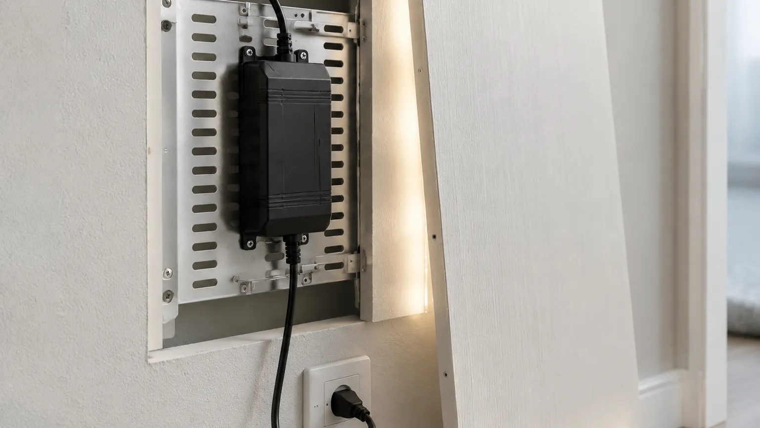
06How a custom order runs, from brief to reorder
A commercial order runs in five steps, and skipping the middle two is what turns a straightforward job into a rework.
Brief
Artwork, finished size, the wall it goes on, indoor or outdoor, and where the power is.
Proof
A to-scale drawing with dimensions, colors and backing shown. Print it full size, or tape the outline up, before approving.
Sample
One physical unit, approved and kept. Optional for a single sign, and the cheapest insurance in the project for a multi-site rollout.
Batch
Built against the approved sample, with per-location name variants running off the same master layout.
Reorder and spares
Quoted against the same spec sheet, so a new studio next year gets the same sign rather than a fresh interpretation.
Quantities, lead times and sample terms are quoted per project: one barbell silhouette for a garage corner and a rollout across six studios are not the same job. What does not change is the sequence — nothing goes to batch until a physical reference exists that everybody has stood in front of.
Budget and durability sit outside that sequence, and both are worth settling before the brief. The breakdown of how much a neon sign costs covers what moves the number, and the guide to how long neon signs last covers the operating side. For a gym the short version: LED neon flex runs on a 12 V or 24 V supply and draws roughly 9 watts per meter, a fraction of what the old high-voltage glass tube drew at the same size (Sygns; Custom Neon, retrieved 2026-08-28).
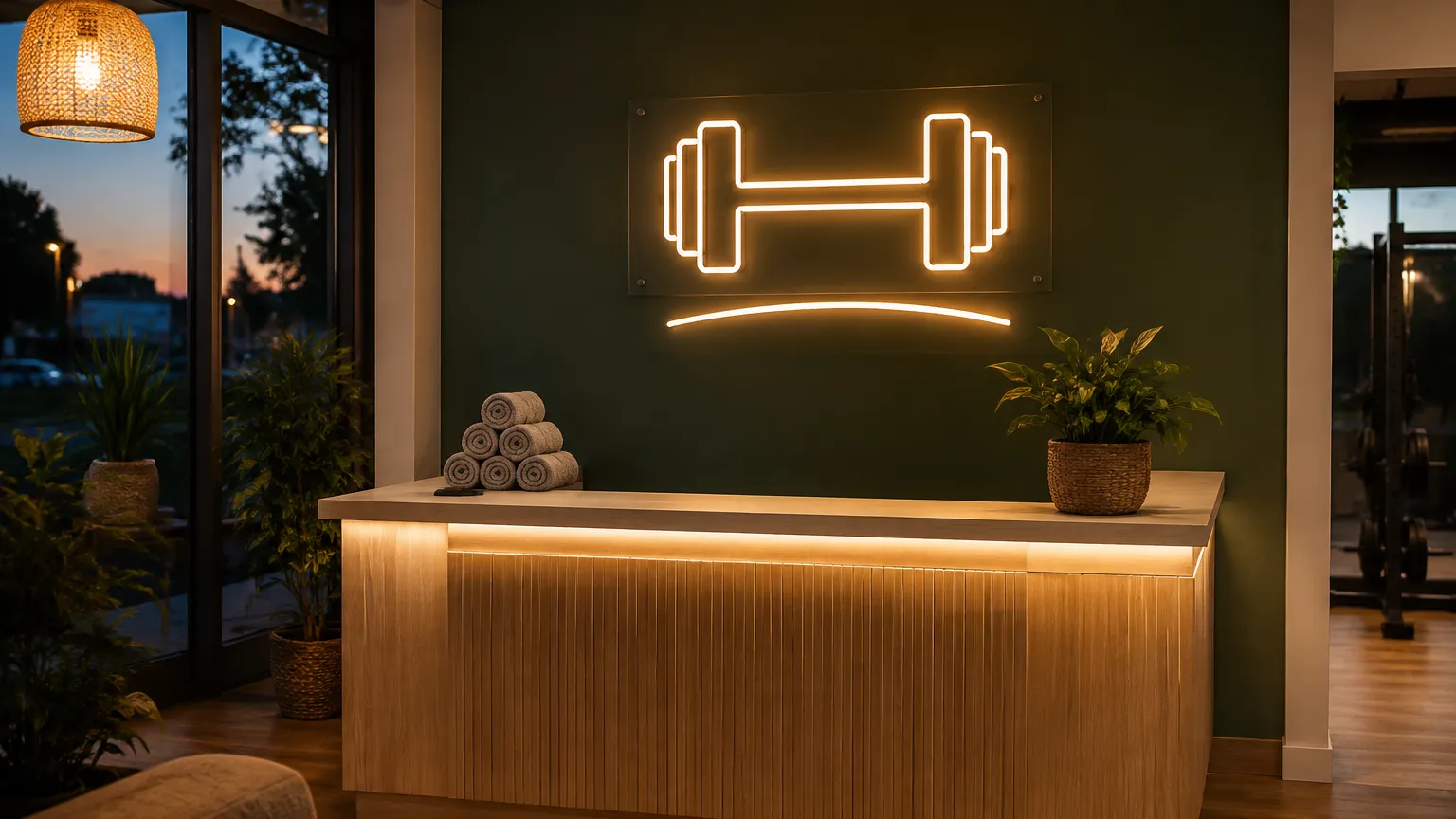
Sizing a sign for a training floor, or rolling one out across studios?
Send a phone photo of the wall, the longest sight line to it, and where the drop zone and the mirror band start. What comes back is a proof you can tape up at full scale: letter height worked from that sight line, mounting clear of the glass, driver position and access, and the reflected view as members will see it. Multi-site rollouts get one approved physical reference kept on file, so studio nine matches studio one.
07Watch it work
Mounting height, letter sizing and the mirror trick, in 36 seconds:
Frequently asked questions
What size barbell neon sign do I need for a home gym?
Measure the longest distance from which you want to read it, divide by ten, and that is your capital letter height in inches (Signs.com; Pannier Graphics). In a garage or spare-room gym that distance is usually eight to twelve feet, which puts you at one to two inches of letter height. For a pure silhouette the constraint is different: size it against the wall and the equipment in front of it, so it does not compete with a rack. Then tape the outline up at full scale, stand where you train, and look at it with the lights you use. Rooms flatter signs on paper and shrink them in reality.
Can I put a barbell neon sign on a mirror wall?
You can, and it is one of the better places for one, but the reflection has to be part of the design rather than a surprise. A mirror doubles the sign at the same size and brightness, and reverses anything with text or an asymmetric shape. A barbell silhouette handles that because it is symmetrical; a script wordmark reads backwards in the glass. There is also a physical limit: on weightlifting and functional fitness floors the mirror band typically starts 12 to 18 inches above the deck and runs well above head height (Fab Glass and Mirror), so the sign lives above the glass rather than on it, and that extra height means slightly larger letters.
How do custom neon gym signs get made from a logo?
The logo is redrawn as a set of continuous paths, because that is physically what a neon run is. A fabricator takes vector artwork, converts it into a sequence of tube runs with the joins and power entry planned in, and returns a to-scale proof showing dimensions, colors, backing and mounting. You approve that proof, then a physical unit, then the batch is built against it. Two things make it go smoothly. Send outlined vector paths with one flat color per section rather than a website image, and expect some simplification: fine detail, gradients, drop shadows and hairline strokes do not exist in tube form. Approving that adaptation in writing at proof stage stops the argument later.
How do I keep a sign out of the drop zone in a weights room?
Keep it outside the working envelope of every piece of equipment near it, and remember the envelope is much bigger than the machine’s footprint. A loaded bar coming off a rack, a bar bounced off a platform, or a kettlebell that gets away all travel further than the equipment dimensions suggest. The practical method is to walk the floor and mark the reach: stand at each rack and platform, extend a bar to full length in every direction someone might rack, drop or press it, and treat everything inside that arc as unavailable wall. Signs then go above that band, on a return wall, or on the reception side. The failure here is not a scratched sign but broken acrylic.
Do I need a vector file of my studio logo before ordering?
In practice yes, and having one saves a proof round. A fabricator needs outlined paths to plan tube runs, joins and power entry, so a mark supplied as a screenshot or a flattened export has to be traced by hand before anything can be quoted accurately. That trace happens either way; the only question is whether you supervise it or discover it at proof. If the original design files are gone, which is common for studios a few years past launch, pay a designer to rebuild the mark as clean vector once: the same file will be wanted for window vinyl, apparel and every future site. Ask for it back in an editable format.
Sources
- Signs.com, Signage 101: Letter Height Visibility (one inch of capital letter height per ten feet), retrieved 2026-08-28.
- Pannier Graphics, Letter Height Visibility Chart for Outdoor Sign Readability, retrieved 2026-08-28.
- Fab Glass and Mirror, Gym Mirror Placement Guide (12 to 18 inches above the floor for weightlifting; flush at 0 inches for yoga and Pilates), retrieved 2026-08-28.
- Gym Insight, Optimal Temperature and Volume Settings for Your Gym (International Fitness Association range: 65 to 68 degrees Fahrenheit, 40 to 60 percent relative humidity), retrieved 2026-08-28.
- Custom Neon, Everything You Need to Know: LED Neon vs Glass Neon (12 V or 24 V supply versus a high-voltage transformer), retrieved 2026-08-28.
- Sygns, Neon Signs Power Consumption and Energy Use (roughly 9 watts per meter), retrieved 2026-08-28.
- Sygns, Gym Neon Signs for Fitness Studios and Interiors (back wall, entrance and reception placements), retrieved 2026-08-28.
- Kings of Neon, How Long Do Neon Signs Last (a cheap power supply cutting life to 1 to 2 years), retrieved 2026-08-28.
