


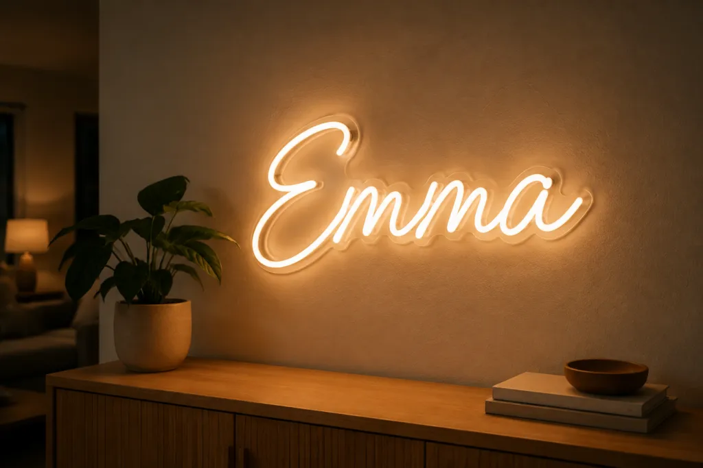
A custom neon name sign is one of the few lighting products where the buyer writes half the specification. You supply the words; the maker forms them in LED neon flex on a cut acrylic backing. The finished width, and whether it reads across a room, come down to four choices you make before anyone can quote you: the text, the font, the size, and how the lines break.
Key takeaways
Fix the exact text first, pick a font that survives as a continuous tube, size the sign from the wall and the viewing distance, then treat the signed proof as the specification.
- Character count is the first real dimension: every extra letter adds tube, backing and width, and a line break turns one object into another.
- A typeface only works in neon if its strokes survive a fixed-width tube: connected scripts are the default, hairline serifs do not survive.
- Size from the mounting surface inward, then check letter height against viewing distance; the trade works to roughly one inch per ten feet.
- The signed proof is the build document: read it character by character, because a misspelling you approved is a remake, not a warranty claim.
- Commercial terms such as order quantity, sample terms and what ships in the box move with the artwork, so ask them against your exact brief.
Start with the text: what a personalized neon name sign has to say
Write the exact string first, capitalization and punctuation included, then treat it as fixed. A personalized neon name sign is built from that string, not picked off a size chart, so character count is the first real dimension in the job.
Length is the obvious driver: each extra character adds tube, backing and width at the same letter height. Line breaks are what buyers underestimate. “Emma Rose” on one line and “Emma” over “Rose” on two are the same words and two different objects.
Settle these before anyone draws anything:
- Apostrophes. “Ava’s Room” needs a floating apostrophe: its own segment, its own mounting point.
- Accents. Confirm your supplier can form non-English characters; do not assume the font covers them.
- Caps versus mixed case. Caps carry at distance but eat width; mixed case is more compact and, in a script, more connected.
Send the string as copy-and-paste text, never a photo of handwriting. Most spelling disputes start with a name retyped by a third party.
Neon sign fonts: stroke continuity beats style
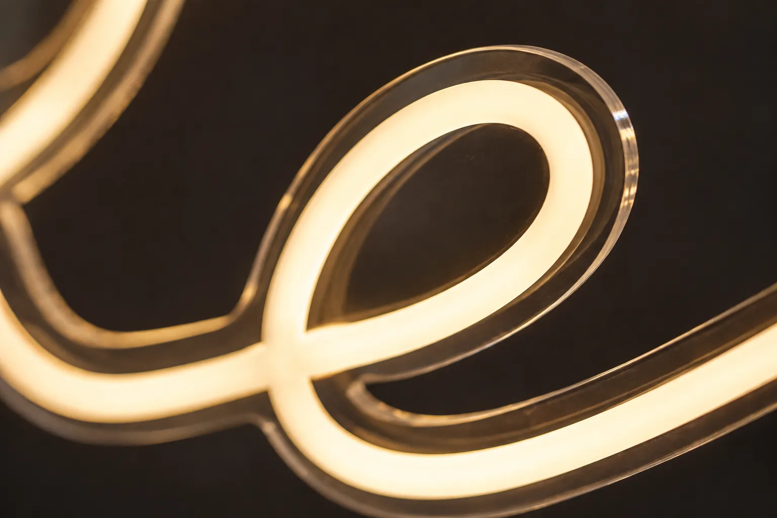
Neon sign fonts are not chosen the way print or web fonts are: the letterform has to survive as a continuous tube of fixed cross-section. Three constraints decide whether a typeface works.
Minimum stroke width. The stroke cannot be thinner than the tube, so hairline serifs and high-contrast faces lose their thick-to-thin modulation entirely. If a font’s personality lives in its thin strokes, it will not survive.
Bend radius. The flex bends in a curve, not a crease, so true right angles come back softly rounded and sharp serif spurs come back blunted.
Counter size. The enclosed spaces inside a, e, o and g shrink faster than the letter does, because stroke thickness is fixed. This is why a small sign can read as a glowing blob rather than a name.
| Font family | What happens in the tube | Where it works |
|---|---|---|
| Connected script | Continuous strokes, fewest starts and joins | Default for name signs |
| Rounded sans | Bend radius matches it; counters stay open | Short names, smaller sizes |
| Geometric sans, sharp corners | Corners return rounded, less exact | Larger sizes only |
| Hairline or high-contrast serif | Thin strokes cannot be reproduced | Avoid, or redraw single-weight |
Ask which fonts your supplier already holds as neon-ready outlines. If your brand font is not among them, budget an extra artwork round while it is redrawn at a single stroke weight.
Sizing: work backwards from the wall
Most custom neon light signs are sized from the mounting surface inward rather than picked from stock widths, because a name sign has to land in a specific gap above a bed, shelf or desk.
- Measure the usable area: the clear span, not the whole wall.
- Subtract a visual margin each side; a sign that stops an inch from a shelf edge looks like a mistake.
- Divide what remains by the character count, then let the supplier convert that allowance into a letter height for your font.
- Check that height against viewing distance before approving anything.
The signage rule of thumb is roughly one inch of letter height per ten feet of viewing distance: a legibility floor, not a target. Above a bed a compact mixed-case script works small; on a wall read from across the room, push the height up and keep the counters open.
Source: United States Sign Council Foundation, On-Premise Sign Legibility research; Signs.com, “Signage 101: Letter Height Visibility” (retrieved 2026-08-25)
Settle the mounting details in the same pass, because they are part of the drawing: backing style (cut to follow the letters, a custom shape, or a plain rectangle), whether it hangs on holes or stands off on spacers, which side the power lead exits, and whether a dimmer is included. The cable exit decides which end faces the outlet.
How custom neon signs design works, from brief to signed proof
Custom neon signs design is a short document-driven loop, and the document that matters is the proof. Once you approve it, it becomes the specification the factory builds to.
Send the brief
Exact text, font or reference image, maximum width or letter height, color, backing style, and where it mounts.
Receive the proof
Scaled artwork on the backing outline with dimensions marked, usually with a room mock-up to judge proportion.
Check it
Against the checklist below, character by character. This is the step people skip.
Approve in writing
After sign-off, a text change means new artwork, not an edit.
Ask for a sample
A physical unit before any repeat program or a run of multiple names.
The proof check takes five minutes and is the highest-value five minutes in the order:
- Read the name character by character, not as a word; your eye corrects a misspelling automatically.
- Confirm the apostrophe, hyphen, accent and any capital that carries meaning.
- Confirm the line breaks match what you asked for, not what reads more naturally.
- Compare the marked width and height to your wall measurement, not to the screen.
- Confirm the backing outline: cut-to-letter and a rectangle are different objects on a wall.
- Confirm the color is named, not only shown; screens misrepresent neon color badly.
A misspelling on a proof you signed is a remake across this industry, not a warranty claim. See the finished formats across our custom neon signs range.
Ordering: the questions to ask before you commit
The artwork is settled by this stage, so what is left is commercial: the questions buyers forget until after the proof is approved.
- Is the minimum order quantity counted per design or per order? It matters if you are running a series of names.
- Are artwork and proofing included, or quoted separately?
- Is a pre-production sample available, and does approving it lock the specification?
- What is in the box: power supply, dimmer or remote, mounting kit, spare hardware?
- How is it packed? Acrylic edges chip, so packing should match your shipping mode.
- What happens if the text changes after approval?
We answer these per project rather than publish one table, because each moves with design complexity, color count and order size. Send the wording, the font and the wall measurement and they come back in one quotation. For the variables behind a quote, see how much a neon sign costs; for durability, see how long neon signs last.
Neon runs across the same floor and the same checks as the rest of what we build, so an artwork question comes back from the building that will form it.
Send your wording, get a proof
Custom name signs, script wall art and repeat retail programs, made in our own factory. Send the exact text, a font reference and your wall measurement and we come back with artwork and a quotation.
Watch it work
The whole custom order flow, in 31 seconds:
Frequently asked questions
How much do custom neon signs cost?
Custom neon is quoted per design, because the variables live in your artwork rather than in a catalog. What moves a quotation most is size, total tube length (a long name in a wide script uses far more than a short one), color count, backing style, whether new artwork is needed, and order quantity. Settle the text, font and maximum width first, then ask for a quotation against that exact brief: any figure quoted before the artwork exists is a guess. Our cost guide breaks those variables down.
Where to buy custom neon signs?
Three routes, suiting different buyers. Online configurators are quickest for a single home sign: you type a name and see it rendered instantly. Marketplaces are cheap to browse, but the maker behind the listing is often unknown. Manufacturers are the route for repeat orders, wholesale or anything using a brand font, because the artwork stage is handled properly. Judge all three the same way: will they show a dimensioned proof before production, will they name the font and color rather than only show a picture, and can they say what ships in the box.
How to make custom LED neon signs?
The production route is consistent across the industry. Your text is drawn as vector artwork at final size, the letterforms are converted to a single-weight stroke path a tube can physically follow, and a backing panel is cut to that outline. LED neon flex is then formed along the path and fixed to the backing, the segments are wired back to a single low-voltage lead, and the piece is lit and inspected before packing. The part that is genuinely yours is the first step, the artwork.
Sources
Every external figure above was checked on 2026-08-25. The legibility rule comes from the sign industry’s own research bodies; construction and voltage claims from LED neon suppliers’ published guides.
- United States Sign Council Foundation, On-Premise Sign Legibility research (letter height versus viewing distance), retrieved 2026-08-25.
- Signs.com, Signage 101: Letter Height Visibility (about one inch of capital letter height per ten feet of viewing distance), retrieved 2026-08-25.
- Pannier Graphics, Letter Height Visibility Chart for Outdoor Sign Readability, retrieved 2026-08-25.
- Custom Neon, Everything You Need to Know: LED Neon vs Glass Neon (LED neon flex runs on a 12 V or 24 V low-voltage supply), retrieved 2026-08-25.
- We Love LEDs, LED Neon Flex vs Traditional Neon Signs (how flex is formed along a backing versus bent glass tube), retrieved 2026-08-25.
- Sygns, Neon Signs Power Consumption and Energy Use (typical per-metre power of LED neon versus glass neon), retrieved 2026-08-25.
